DATA100-lab11: Principal Component Analysis
|
|
Lab 11: Principal Component Analysis
In this lab assignment, we will walk through two examples that use Principal Component Analysis (PCA): one involving a dataset of iris plants, and another involving an artificial “surfboard” 3D dataset.
|
|
In lecture we discussed how Principal Component Analysis (PCA) can be used for dimensionality reduction. Specifically, given a high dimensional dataset, PCA allows us to:
- Understand the rank of the data. If $k$ principal components capture almost all of the variance, then the data is roughly rank $k$.
- Create 2D scatterplots of the data. Such plots are a rank 2 representation of our data, and allow us to visually identify clusters of similar observations.
In this lab, you’ll learn how to perform PCA using the np.linalg package (Part 1), and you’ll also build a geometric intuition of PCA to help you understand its strengths (Part 2). We work with low-dimensional datasets for now to focus on the basics; in the homework, you’ll explore how PCA works on a high-dimensional dataset.
Part 1: The Iris Dataset
To begin, run the following cell to load the dataset into this notebook.
iris_featureswill contain a numpy array of 4 attributes for 150 different plants (shape150 x 4).iris_targetwill contain the class of each plant. There are 3 classes of plants in the dataset: Iris-Setosa, Iris-Versicolour, and Iris-Virginica. The class names will be stored iniris_target_names.iris_feature_nameswill be a list of 4 names, one for each attribute iniris_features.
|
|
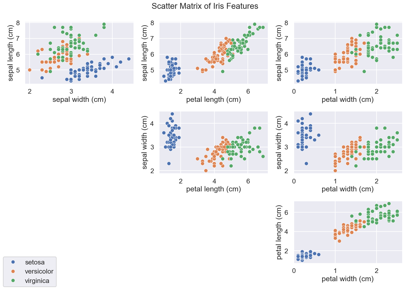
Let’s explore the data by creating a scatter matrix of our iris features. To do this, we’ll create 2D scatter plots for every possible pair of our four features. This should result in six total scatter plots in our scatter matrix with the classes labeled in distinct colors for each plot.
|
|

Question 1: Standardization and SVD
Question 1a
To apply PCA, we will first need to center the data so that the mean of each feature is 1. We could go further and create standardized features, where we scale features such that they are centered with standard deviation 1. (We’ll explore simple centered data in Part 2.)
Compute the columnwise mean of iris_features in the cell below and store it in iris_mean, and compute the columnwise standard deviation of iris_features and store it in iris_std. Each should be a numpy array of 4 means, 1 for each feature. Then, subtract iris_mean from iris_features and divide by iris_std, and finally, save the result in iris_standardized.
Hints:
- Use
np.mean(documentation) ornp.average(documentation) to computeiris_mean, and pay attention to theaxisargument. Same fornp.std(documentation). - 制定好axis参数很重要!Because PCA will capture the bigger stddev features, we want to standardize them or will lead to artificial error!
- If you are confused about how numpy deals with arithmetic operations between arrays of different shapes, see this note about broadcasting for explanations/examples. 广播机制!
|
|
(array([5.84333333, 3.05733333, 3.758     , 1.19933333]),
 array([0.82530129, 0.43441097, 1.75940407, 0.75969263]))
|
|
Question 1b
As you may recall from lecture, PCA is a specific application of the singular value decomposition (SVD) for matrices. In the following cell, let’s use the np.linalg.svd function (documentation) to compute the SVD of our iris_standardized matrix.
Store the left singular vectors $U$, singular values $\Sigma$, and (transposed) right singular vectors $V^T$ in u, s, and vt, respectively. Set the full_matrices argument of np.linalg.svd to False.
Notice: PCA is a application of SVD on centered data matrix. 🤔
|
|
((150, 4), array([20.92306556, 11.7091661 , 4.69185798, 1.76273239]), (4, 4))
|
|
Question 1c
What can we learn from the singular values in s?
As discussed in lecture, the total variance of the data is also equal to the sum of the squares of the singular values divided by the number of data points, that is:
$$\text{Var}(X) = \frac{\sum_{i=1}^d{\sigma_i^2}}{N} = \sum_{i=1}^d \frac{\sigma_i^2}{N}$$
where for data $X$ with $N$ datapoints and $d$ features, $\sigma_i$ is the singular value corresponding to the $i$-th principal component, and $\text{Var}(X)$ is the total variance of the data. The right-hand side implies that the expression $\sigma_i^2/N$ is the amount of variance captured by the $i$-th principal component.
Compute the total variance of our data below by summing the square of each singular value in s and dividing the result by the total number of data points. Store the result in the variable iris_total_variance.
|
|
iris_total_variance: 4.000 should approximately equal the sum of the feature variances: 4.000
|
|
As you can see, iris_total_variance is equal to the sum of the standardized feature variances. Since our features are standardized (i.e., have variance 1), iris_total_variance is equal to the number of original features.
Question 2
Question 2a
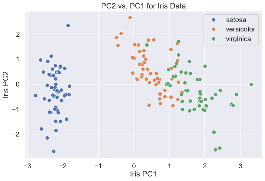
Let’s now use only the first two principal components to see what a 2D version of our iris data looks like.
First, construct the 2D version of the iris data by multiplying our iris_standardized array with the first two right singular vectors in $V$. Because the first two right singular vectors are directions for the first two principal components, this will project the iris data down from a 4D subspace to a 2D subspace.
Hints:
- To matrix-multiply two numpy arrays, use
@ornp.dot. In case you’re interested, the matmul documentation contrasts the two methods. - Note that in Question 1b, you computed
vt(SVD decomposition is $U\Sigma V^T$). The first two right singular vectors in $V$ will be the two rows ofvt, transposed to be column vectors instead of row vectors. - Since we want to obtain a 2D version of our iris dataset, the shape of
iris_2dshould be (150, 2).
|
|
np.float64(-2.5579538487363607e-13)
|
|
Now, run the cell below to create the scatter plot of our 2D version of the iris data, iris_2d.
|
|

Question 2b
What do you observe about the plot above? If you were given a point in the subspace defined by PC1 and PC2, how well would you be able to classify the point as one of the three Iris types?
Question 2c
What proportion of the total variance is accounted for when we project the iris data down to two dimensions? Compute this quantity in the cell below by dividing the variance captured by the first two singular values (also known as component scores) in s by the iris_total_variance you calculated previously. Store the result in iris_2d_variance.
|
|
np.float64(0.9581320720000164)
|
|
Most of the variance in the data is explained by the two-dimensional projection!
Question 3
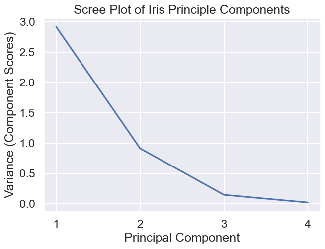
As a last step, we will create a scree plot to visualize the weight of each principal component. In the cell below, create a scree plot by creating a line plot of the component scores (variance captured by each principal component) vs. the principal component number (1st, 2nd, 3rd, or 4th). Your graph should match the image below:
Hint: Be sure to label your axes appropriately! You may find plt.xticks() (documentation) helpful for formatting.

|
|

Part 2: PCA on 3D Data
In Part 2, our goal is to see visually how PCA is simply the process of rotating the coordinate axes of our data.
The code below reads in a 3D dataset. We have named the DataFrame surfboard because the data resembles a surfboard when plotted in 3D space.
|
|
| x | y | z | |
|---|---|---|---|
| 0 | 0.005605 | 2.298191 | 1.746604 |
| 1 | -1.093255 | 2.457522 | 0.170309 |
| 2 | 0.060946 | 0.473669 | -0.003543 |
| 3 | -1.761945 | 2.151108 | 3.132426 |
| 4 | 1.950637 | -0.194469 | -2.101949 |
[Tutorial 1] Visualize the Data
The cell below will allow you to view the data as a 3D scatterplot. Rotate the data around and zoom in and out using your trackpad or the controls at the top right of the figure.
You should see that the data is an ellipsoid that looks roughly like a surfboard or a hashbrown patty. That is, it is pretty long in one direction, pretty wide in another direction, and relatively thin along its third dimension. We can think of these as the “length”, “width”, and “thickness” of the surfboard data.
Observe that the surfboard is not aligned with the x/y/z axes.
If you get an error that your browser does not support webgl, you may need to restart your kernel and/or browser.
|
|
Visualize the Data (Colorized)
To give the figure a little more visual pop, the following cell does the same plot, but also assigns a pre-determined color value (that we’ve arbitrarily chosen) to each point. These colors do not mean anything important; they’re simply there as a visual aid.
You might find it useful to use the colorize_surfboard_data method later in this lab.
|
|
Question 4: Centering and SVD
Question 4a
In Part 1, we standardized the Iris data prior to performing SVD, i.e., we made features zero-mean and unit-variance. In this part, we’ll try just centering our data so that each feature is zero-mean and variance is unchanged.
Compute the columnwise mean of surfboard in the cell below, and store the result in surfboard_mean. You can choose to make surfboard_mean a numpy array or a series, whichever is more convenient for you. Regardless of what data type you use, surfboard_mean should have 3 means: 1 for each attribute, with the x coordinate first, then y, then z.
Then, subtract surfboard_mean from surfboard, and save the result in surfboard_centered. The order of the columns in surfboard_centered should be x, then y, then z.
|
|
|
|
Question 4b
In the following cell, compute the singular value decomposition (SVD) of surfboard_centered as $U\Sigma V^T$, and store the left singular vectors $U$, singular values $\Sigma$, and (transposed) right singular vectors $V^T$ in u, s, and vt, respectively.
Your code should be very similar to Part 1, Question 1b up above.
|
|
(array([[-0.02551985,  0.02108339,  0.03408865],
        [-0.02103979,  0.0259219 , -0.05432967],
        [-0.00283413,  0.00809889, -0.00204459],
        ...,
        [ 0.01536972,  0.00483066, -0.05673824],
        [-0.00917593, -0.0345672 , -0.03491181],
        [-0.01701236, -0.02743128,  0.01966704]]),
 array([103.76854043,  40.38357469,  21.04757518]),
 array([[ 0.38544534, -0.67267377, -0.63161847],
        [ 0.5457216 ,  0.7181477 , -0.43180066],
        [ 0.74405633, -0.17825229,  0.64389929]]))
|
|
Question 4c: Total Variance
In Part 1 Question 1c, we considered standardized features (each with unit variance), whose total variance was simply the count of features. Now, we’ll show that the same relationship holds between singular values s and the variance of our (unstandardized) data.
In the cell below, compute the total variance as the sum of the squares of the singular values $\sigma_i$ divided by the number of datapoints $N$. Here’s that formula again from Question 1c:
$$\text{Var}(X) = \frac{\sum_{i=1}^d{\sigma_i^2}}{N} = \sum_{i=1}^d \frac{\sigma_i^2}{N}$$
|
|
np.float64(12.841743509780112)
|
|
Your total_variance_computed_from_singular_values result should be very close to the total variance of the original surfboard data:
|
|
x    2.330704
y    5.727527
z    4.783513
dtype: float64
The total variance of our dataset is given by the sum of these numbers.
|
|
12.841743509780109
Note: The variances are the same for both surfboard_centered and surfboard (why?), so we show only one to avoid redundancy.
Question 4d: Variance Explained by First Principal Component
In the cell below, set variance_explained_by_1st_pc to the proportion of the total variance explained by the 1st principal component. Your answer should be a number between 0 and 1.
|
|
np.float64(0.8385084140449135)
|
|
We can also create a scree plot that shows the proportion of variance explained by all of our principal components, ordered from most to least. You already constructed a scree plot for the Iris data, so we’ll leave the surfboard scree plot for you to do on your own time.
Instaed, let’s try to visualize why PCA is simply a rotation of the coordinate axes (i.e., features) of our data.
Question 5: V as a Rotation Matrix
In lecture, we saw that the first column of $XV$ contained the first principal component values for each observation, the second column of $XV$ contained the second principal component values for each observation, and so forth.
Let’s give this matrix a name: $P = XV$ is sometimes known as the “principal component matrix”.
Compute the $P$ matrix for the surfboard dataset and store it in the variable surfboard_pcs.
Hint: What does $X$ represent here: surfboard or surfboard_centered? Why?
|
|
|
|
[Tutorial 2] Visualizing the Principal Component Matrix
In some sense, we can think of $P$ as an output of the PCA procedure.
$P$ is a rotation of the data such that the data will now appear “axis aligned”. Specifically, for a 3d dataset, if we plot PC1, PC2, and PC3 along the x, y, and z axes of our plot, then the greatest amount of variation happens along the x-axis, the second greatest amount along the y-axis, and the smallest amount along the z-axis.
To visualize this, run the cell below, which will show our data now projected onto the principal component space. Compare with your original figure (from Tutorial 1 in this part), and observe that the data is exactly the same—only it is now rotated.
|
|
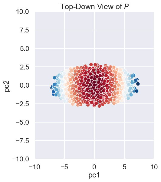
We can also create a 2D scatterplot of our surfboard data as well. Note that the resulting is just the 3D plot as viewed from directly “overhead”.
|
|

Part 2 Summary
Above, we saw that the principal component matrix $P$ is simply the original data rotated in space so that it appears axis-aligned.
Whenever we do a 2D scatter plot of only the first 2 columns of $P$, we are simply looking at the data from “above”, i.e. so that the 3rd (or higher) PC is invisible to us.